Tatso Homemade Ice Cream
Tatso
Logo Design
Client Challenge: Mahlatse Lentsoane, founder of Tatso homemade, approached us to assist her with creating a logo and CI collateral which reflects her brand of yummy homemade dairy products, mainly ice-cream.
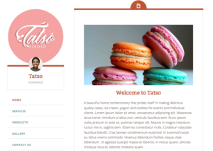
Tatso logo on the website
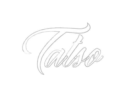
Our Solution: We created a typographic logo inspired by the splashing movement of milk when it is poured into a glass. We wanted it to look delicious.
- Illustration
- Typography design
- Logo Design
- Branding
- Identity Design
Meghaa’s approach
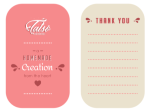
The logo had to look tasty. This was my starting point. The stylised typography was inspired by milk because this is the primary ingredient of the product. The custom cursive serifs are referenced from milk splashes. The splashes were also inspiration to create an animated email signature of the milk splashing. The pink secondary colour was requested by client. A minimal layout design complements the subtle details on the logo design.
Client Love
Thank you for assisting with a logo design that resonates with the type of product or service we produce.
It verbalises authentic homemade treats made with love and passion. Mahlatse Lentsoane