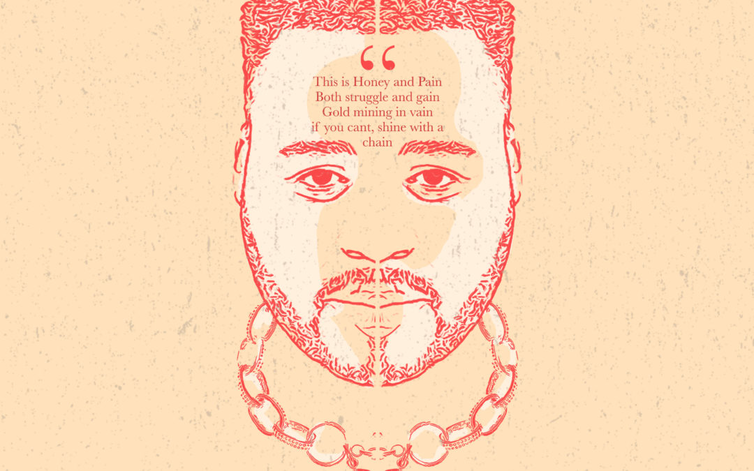
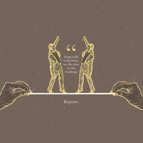
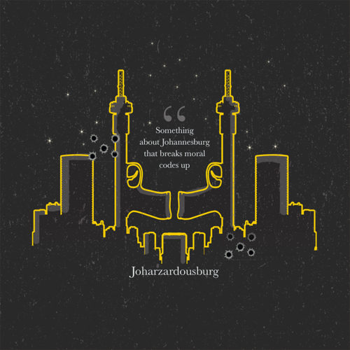
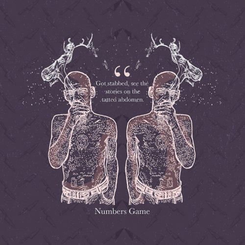
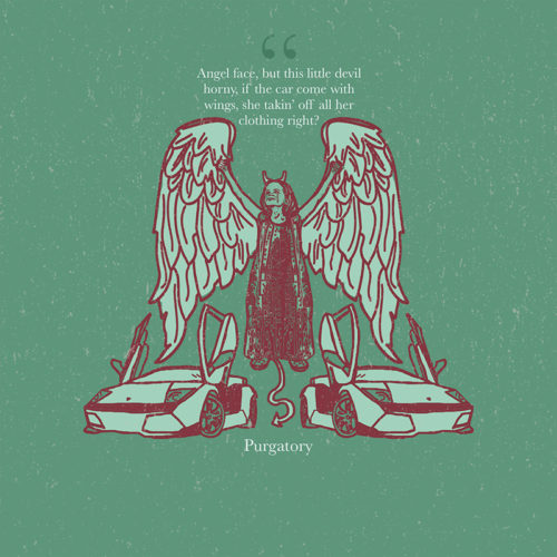
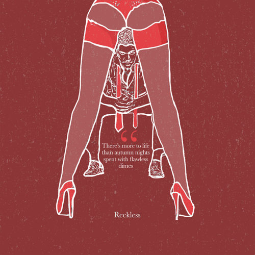
Client Challenge: Coming up with music artwork that accompanies the music on Stogie T’s mixtape
Our Solution: Keeping in line with the theme of the Title track; “Honey & Pain,” we visually explored his theme of duality. We used symmetry in design and strong contrasts between dark and light colours in our pallete. All visual elements were referenced from the lyrics in the respective songs on the mixtape.
Illustration
Graphic Design
Corporate Identity Design
Dave’s approach
I kept the colours more muted, in contrast to my usual bright style. I tried to be more conceptual and maintain Stogie T’s intergrity visually.
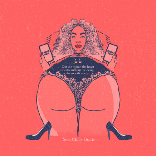
Client Challenge: Coming up with a poster design that speaks to a more mature, but young hip market.
Our Solution: We used vibrant colours, a subtle, patterned background and contrasted black&white photography to have an energetic poster that resonates with the targeted consumers
Illustration
Graphic Design
Corporate Identity Design
Lerato’s approach
I played around with lots of colours and tried to have a cool contrasting effect with the black&white photography
Client Challenge: Coming up with an identity for a very fluid and agile new disruptive content agency that doesn’t necessarily adhere to one specific look & feel. This our 3rd project with one of our favourite clients; Takunda Bimha.
Our Solution: We came up with a flexible, multi-coloured approach, using a set number of colours that will represent the brand going forward.
Illustration
Graphic Design
Corporate Identity Design
Dave’s approach
I played around with lots of colours and narrowed it down to the pallete that the clients loved the most.
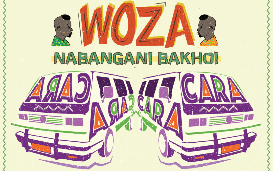
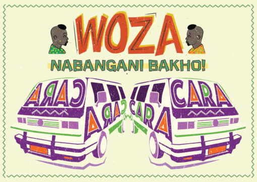
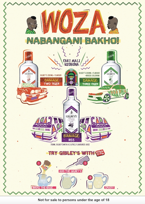
Client Challenge: Our challenge was to help our client, Libra Productions, with their campaign to explore and encourage new township drinking rituals for a DiegoSA mainstream spirit, Gilbey’s. We assisted them by designing point-of-sale collaterol that delivers on the message of a mixability drinking ritual at an affordable price. We were charged with ensuring that the message was communicated in a language/style that is native to the market, we applied our minds to the copy-writing, design and layout of the posters.
Our Solution: Working closely with our client, who wanted the work to draw deeply from the real world insight of the sharing culture ukugazatha, we co-created the poster campaign that advertised some ‘combos’ named after township names for popular cars. The aim was for the artwork to connect with consumers and spark conversation, encouraging consumers to enquire about and trial the product.
Illustration
Copywriting
Graphic Design
Poster Design
Dave’s approach
Drawing on references of township small business hand-drawn signage, I layered together illustrated elements like the vehicles with custom typography, making the “kasi lingo” pop. We wanted the posters to pique the consumers curiosity in taverns, driving them to ask for more information on the combo products advertised. We really enjoyed the co-creation with our client and drawing on our cultural intelligence and applying our copywriting skills to the task at hand.
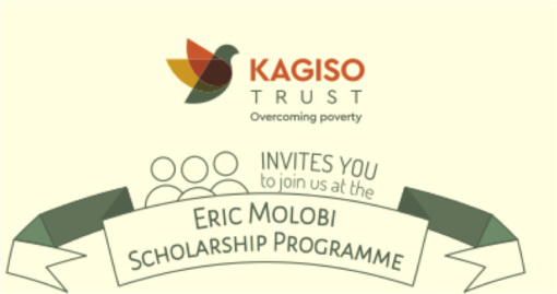
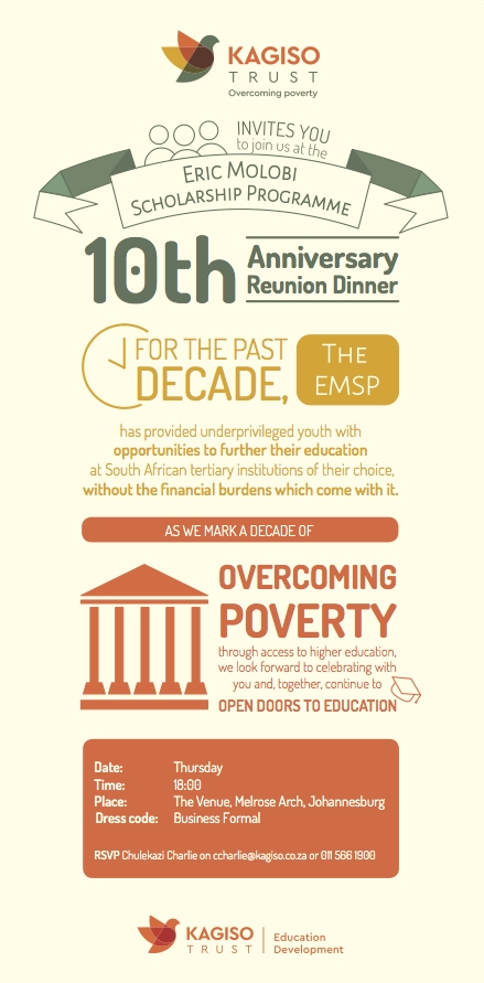
Client Challenge: Our client Kagiso Trust commissioned us to design an invitation for the Eric Molobi Scholarship Programme 10th Anniversary Reunion Dinner.
Our Solution: We wanted the invitation, which was quite copy-heavy, to be easy-to-read and enticing, piqueing the guests’ interest and encouraging attendance at the event.
Illustration
Graphic Design
Invitation Design
Dave’s approach
Drawing from the warm and welcoming colours of the logo, I designed an infographic-influenced invitation, laying the text out in an easy-to-read way that highlighted the key points requiring attention.