Stogie T: Honey & Pain
Stogie T: Honey&Pain
Poster Design
Client Challenge: Coming up with music artwork that accompanies the music on Stogie T’s mixtape
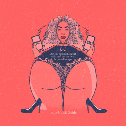
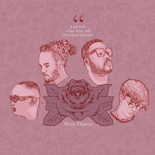
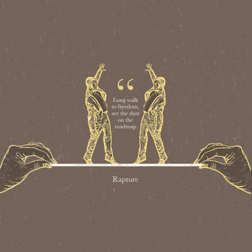
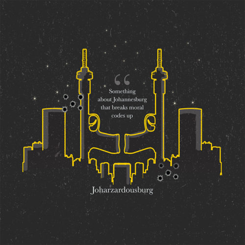
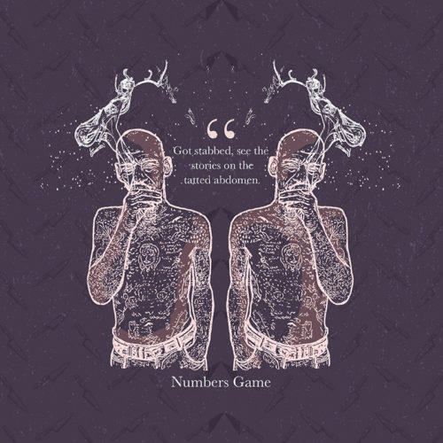
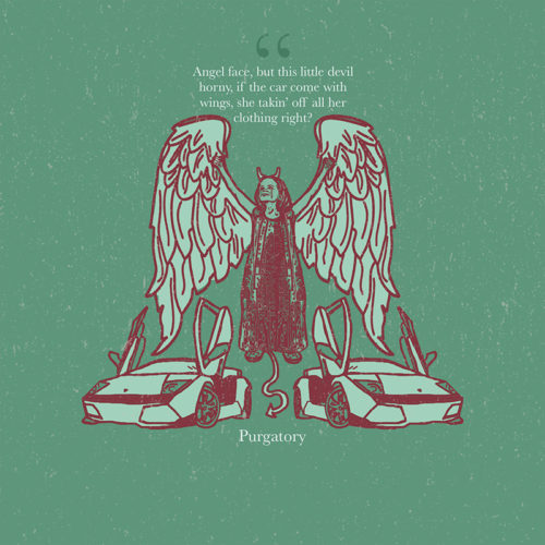
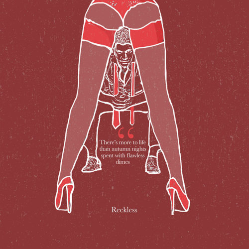
Our Solution: Keeping in line with the theme of the Title track; “Honey & Pain,” we visually explored his theme of duality. We used symmetry in design and strong contrasts between dark and light colours in our pallete. All visual elements were referenced from the lyrics in the respective songs on the mixtape.
- Illustration
- Graphic Design
- Corporate Identity Design
Dave’s approach
I kept the colours more muted, in contrast to my usual bright style. I tried to be more conceptual and maintain Stogie T’s intergrity visually.